World of Little Interiors
The Secrets to a Perfect Child's Room
Creating a stylish child’s room is tougher than it looks, so we asked Ken Fulk, the San Francisco-based interior designer, how to get it right the first time.
- Photography
- Douglas Friedman
- Written By
- Ken Fulk
Whomever came up with the parenting maxim “little kids, little problems; big kids, bigger problems” was probably not an interior designer because one of the most challenging tasks for parents when it comes to design is a little kid’s room. We’ve all had the experience of walking through an otherwise elegant apartment and then peering into a nursery that looks as if a big can of whimsy exploded. So, let’s not do that. As someone who has designed houses from Mexico to Montana, I’ve picked up a few things along the way. I hope these pointers are helpful to you as you add a chic little person to your life.
Where to start?
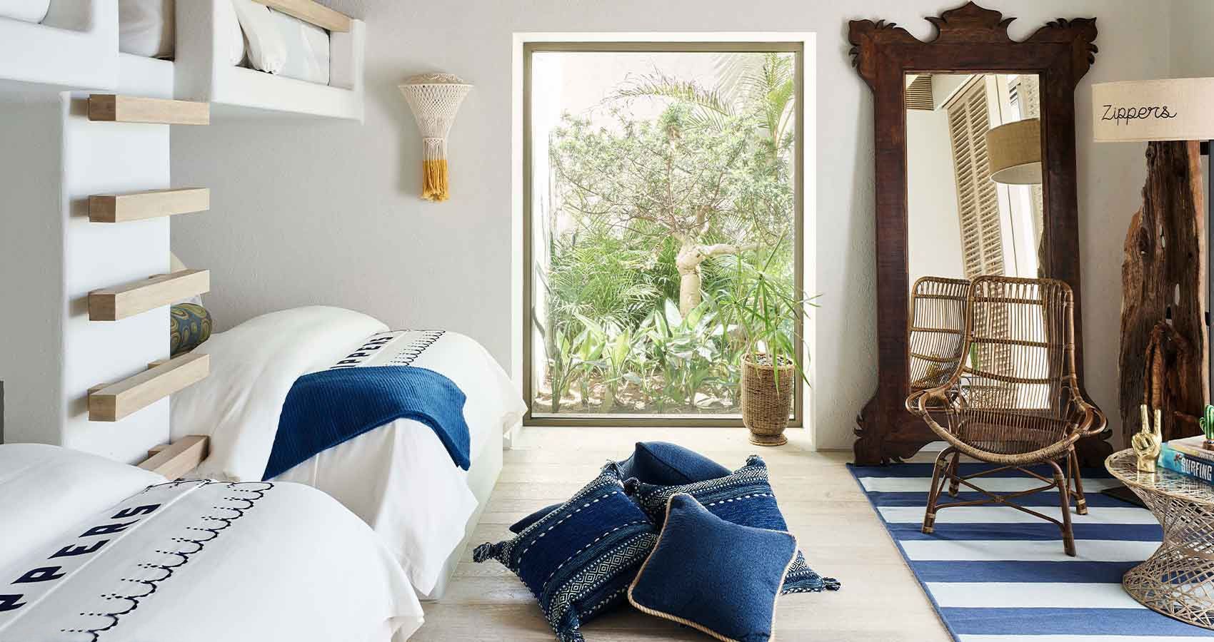
A child’s room should feel magical and spark the imagination. The patterns, images, colors and textures you’re surrounded with as a child help formulate your aesthetic so it’s truly important. I do feel like a child’s room should feel somehow in keeping with the rest of the house – it may be a highly whimsical, editorial version of the house’s style narrative, but it’s the “same movie,” as we like to say at my firm.
I often look to the settings of classic fairy tales or adventure stories for nursery inspiration. The illustrations of vintage Hans Christian Andersen or Swiss Family Robinson books have offered plenty of fodder for kids’ rooms. It’s a fun exercise to envision the child as the heroic main character of that tale outwitting a tricky fox or sailing a rocket through the stars.
What are some common mistakes?
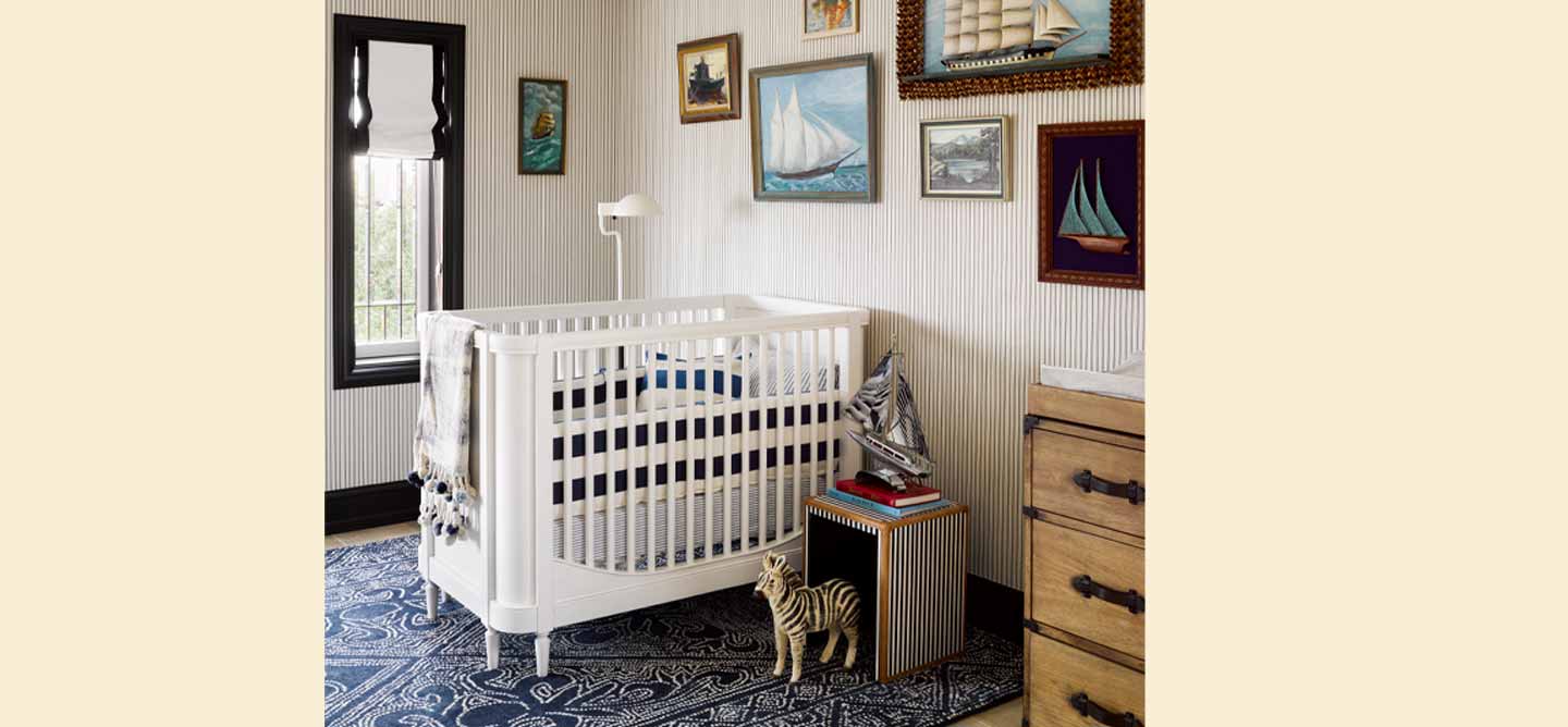
Number one: The pink and blue color palettes. It’s so tempting, but resist the urge to gender-ize design! Furthermore, nurseries don’t always have to be serene color schemes. Babies love contrast so consider a tailored look in black and white or navy and shell pink. And don’t be afraid of pattern and texture for stimulation during the day. Additionally, a well-orchestrated lighting plan makes it easy to tone things down for naps or nighttime.
Number two: Lilliputian rooms! Try not to size everything in a room down to miniature proportions. The proportions of a bedroom are sized for adults, so the scale gets thrown off when everything is sized down and the ceiling is soaring too far above. Plus, tiny little tables and chairs make it very hard for grown-ups to join the fun for bedtime stories and tea parties.


How do I get scale right?
In addition to a crib and changing table, a sizable chair and ottoman or a cozy daybed plus a rounded coffee table make it welcoming for all.
Another way to help scale up the space is to go for oversize lighting fixtures and artwork. We often do narrative murals in children’s bedrooms so that art is at eye level for everyone.
Where’s the line between cute and kitsch?
Pick a concept that will translate to children but steer clear of hokey. Even if your inspiration point is fairly sophisticated, say, Jules Verne’s "20,000 Leagues Under the Sea," children quickly learn about underwater creatures and will get the point. That doesn’t mean you have to dumb it down. Elaborate illustrations of giant squid, nautical diagrams, a brass diving bell, braided rope patterns — all of these get the message across whether you’re 3 or 73!


What should I splurge on?
Everyone seems to acknowledge the desire for high-quality furniture that is safe, non-toxic and finely crafted but then they skimp when it comes to rugs and that’s actually where babies and kids spend the majority of their time! It sounds indulgent but rug in hand-knotted wool or wool-and-viscose blend can’t be beaten as a cozy crawling ground. It’s an investment but it will last for generations because it won’t shed or get threadbare.
Also, we’ve gotten many requests for black-out blinds in nurseries, where cordless, durable window treatments are needed. Choose a quality workroom to create custom blinds with a nice heavy liner and hardworking functionality — you won’t regret it!
On the other hand, artwork is a smart place to save money. In my opinion, it is absolutely necessary to hang art in a child’s room if only to give them aspirations for their own artistry, but blue chip is not necessary. Instead, consider a salon wall featuring a series of framed images from a favorite illustrated book.
Should I focus on baby or big kid?
Definitely design for the long game. Spending a lot of time and money on a room especially designed for a newborn is kind of a fool’s errand. There’s usually no avoiding the gadgets of today’s infants and the necessities of a changing table or feeding station, all of which are hideous no matter how well-designed they claim to be.
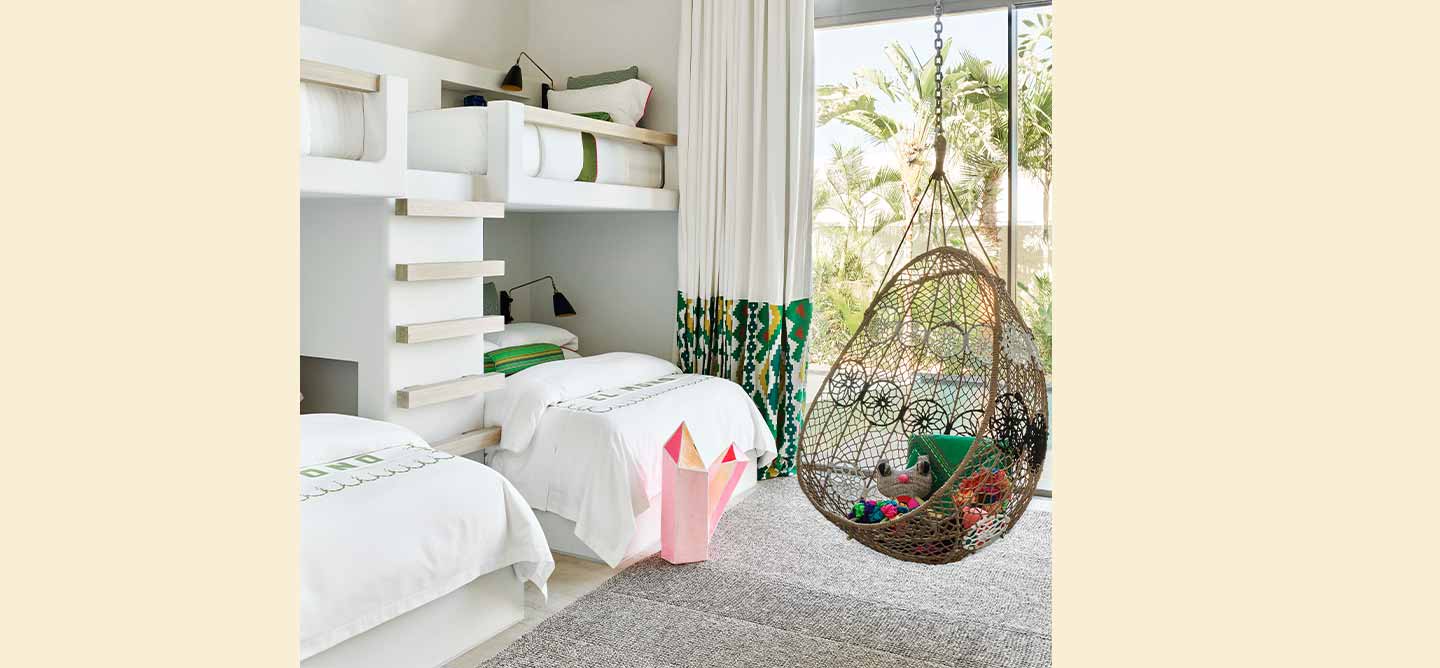
The better plan is to design for the sleeping-through-the-night stage when the room truly becomes their own. Then try to create something that will maintain its look after the crib is replaced by a bed, the changing table becomes a dresser and the toys begin to multiply. I might recommend a refresh around the age of 4 or 5, as a special way to mark the shift from “baby” to “kid.” At that point, they usually want a say in the colors and design of their rooms.
Ken Fulk is a San Francisco-based interior designer. His most recent public projects include the #saintjosephsartsociety. To learn more about his work, check out kenfulk.com.
Ken's Picks